
RICK GASTON
I love a great logo. When it works, it works, whether it's for an event, a small startup, or a global enterprise. A logo is often the first expression of a brand that people encounter, and it can leave a lasting impression. Here are some of my favorites from over the years.

Project
Workday 20th Anniversary Logo
Role
Art Director/Designer
Challenge
Create a simple, distinctive logo for Workday's 20th anniversary that adhered to brand standards and scaled across a wide range of applications.
Outcome
The anniversary was celebrated throughout the year, with special branding and messaging appearing at major events such as Workday Rising. The lockup was used across digital and print communications, event environments, and branded merchandise and gifts.
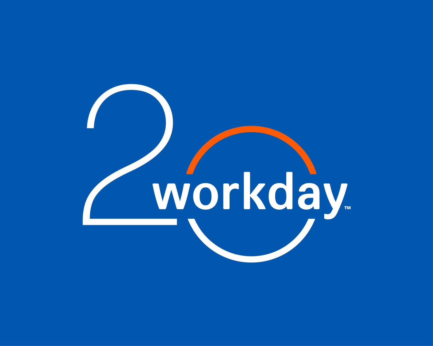
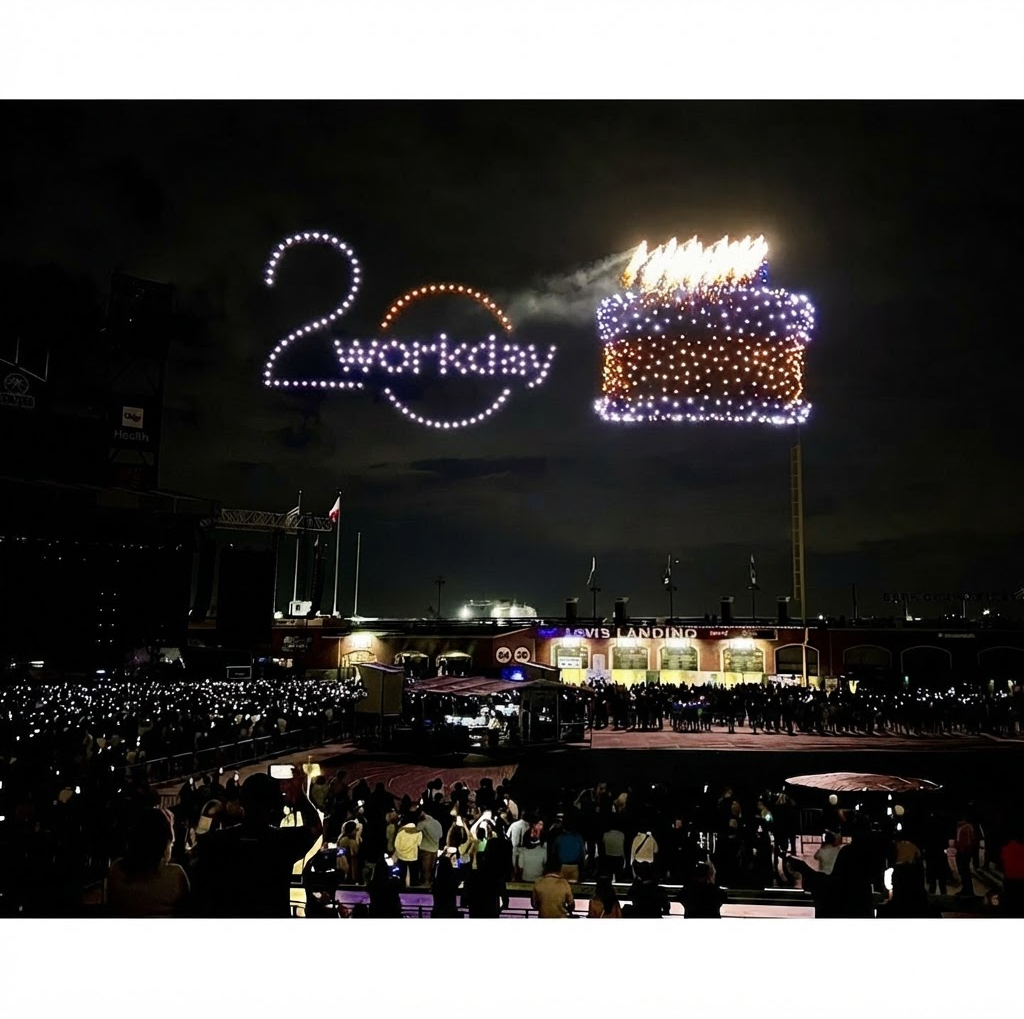
One of my favorites. I like how the design elements are integrated with each other. There is no “20” without the Workday logo. Seeing it rendered by drones was icing on the cake.
Project
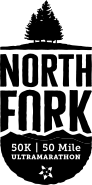
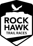
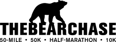
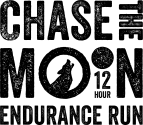
Bearchase Race Series
Role
Art Director/Designer
Challenge
Develop a unified logo system for a race series and its four events. The identities needed to be modern, energetic, and versatile enough to reproduce in a single color.
Outcome
The logos were successful both individually and as a cohesive set, translating especially well across apparel and merchandise. Runners looked great in their finishers shirts.


Based in Colorado, the graphics draw inspiration from the region's wildlife and mountain landscapes. Clean geometric shapes combine with hand-drawn textures to create a modern, rugged aesthetic. As a trail runner myself, this project was especially rewarding.
Project
More Brand Identities
Role
Art Director/Designer
Challenge
The goals are similar across brand identity projects: create a logo that captures the organization’s attributes, values, aspirations, personality, and industry. Each identity should stand apart from the competition, feel distinctive and ownable, and work across every touchpoint. Bonus points for being clever and compact.
Outcome
These logos were selected and implemented across a range of real world applications and touchpoints, representing everything from individual events to corporate brands. Each gave its organization or event a distinctive visual presence.




Project
Event Lockups
Role
Art Director/Designer
Challenge
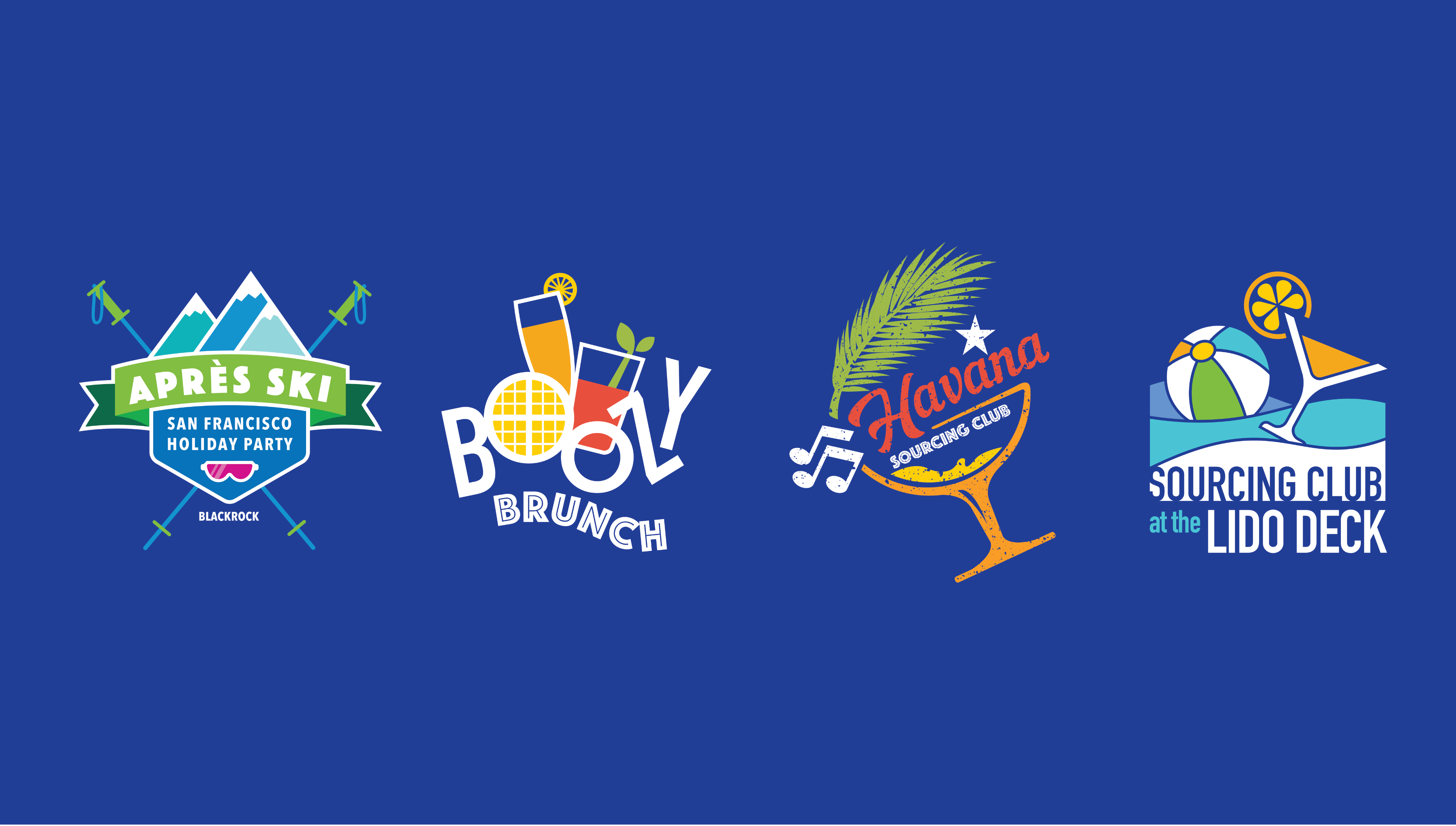
Make it fun! Smaller programs within a larger conference may be short-lived, but they still deserve their own moment. With a little extra time and TLC, they can look stellar, attract more attention, and add to the energy and vibe of the overall event.
Outcome
These programs turned out to be quite successful. The branding, carried consistently across the different touchpoints, helped create the festive, fun atmosphere we envisioned. Each attracted plenty of attention and enjoyed strong attendance.
Project
Additional Brand Identities
Role
Art Director/Designer



I love a great logo. When it works, it works, whether it's for an event, a small startup, or a global enterprise. A logo is often the first expression of a brand that people encounter, and it can leave a lasting impression. Here are some of my favorites from over the years.

Project
Workday 20th Anniversary Logo
Role
Art Director/Designer
Challenge
Create a simple, distinctive logo for Workday's 20th anniversary that adhered to brand standards and scaled across a wide range of applications.
Outcome
The anniversary was celebrated throughout the year, with special branding and messaging appearing at major events such as Workday Rising. The lockup was used across digital and print communications, event environments, and branded merchandise.
One of my favorites. I like how the design elements are integrated with each other. There is no “20” without the Workday logo. Seeing it rendered by drones was icing on the cake.
Project
Bearchase Race Series
Role
Art Director/Designer
Challenge
Develop a unified logo system for a race series and its four events. The identities needed to be modern, energetic, and versatile enough to reproduce in a single color.
Outcome
The logos were successful both individually and as a cohesive set, translating especially well across apparel and merchandise. Runners looked great in their finishers shirts.



Based in Colorado, the graphics draw inspiration from the region's wildlife and mountain landscapes. Clean geometric shapes combine with hand-drawn textures to create a modern, rugged aesthetic. As a trail runner myself, this project was especially rewarding. I first met the owner and race director while competing in a local 50-mile trail race.
Project
More Brand Identities
Role
Art Diretor/Designer
Challenge
The goals are similar across brand identity projects: create a logo that captures the organization’s attributes, values, aspirations, personality, and industry. Each identity should stand apart from the competition, feel distinctive and ownable, and work across every touchpoint. Bonus points for being clever and compact.
Outcome
These logos have been selected and implemented, representing everything from individual events to overarching corporate brand identities across a range of real-world applications and touchpoints. Each gave its organization or event a distinct and recognizable visual presence.
Project
Event Lockups
Role
Art Director/Designer
Challenge
Make it fun! Smaller programs within a larger conference may be short-lived, but they still deserve their own moment. With a little extra time and TLC, they can look stellar, attract more attention, and add to the energy and vibe of the overall event.
Outcome
The programs were successful, with branding carried consistently across each touchpoint to help create the festive, energetic atmosphere we envisioned. Each attracted attention and generated strong attendance.
Project
Additional Brand Identities
Role
Art Diretor/Designer

I love a great logo. When it works, it works, whether it's for an event, a small startup, or a global enterprise. A logo is often the first expression of a brand that people encounter, and it can leave a lasting impression. Here are some of my favorites from over the years.
Project
Workday 20th Anniversary Logo
Role
Art Director/Designer
Challenge
Create a simple, distinctive logo for Workday's 20th anniversary that adhered to brand standards and scaled across a wide range of applications.
Outcome
The anniversary was celebrated throughout the year, with special branding and messaging appearing at major events such as Workday Rising. The lockup was used across digital and print communications, event environments, and branded merchandise.
One of my favorites. I like how the design elements are integrated with each other. There is no “20” without the Workday logo. Seeing it rendered by drones was icing on the cake.
Project
Bearchase Race Series
Role
Art Director/Designer
Role
Art Director/Designer
Outcome
The logos were successful both individually and as a cohesive set, translating especially well across apparel and merchandise. Runners looked great in their finishers shirts.
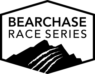
Based in Colorado, the graphics draw inspiration from the region's wildlife and mountain landscapes. Clean geometric shapes combine with hand-drawn textures to create a modern, rugged aesthetic. As a trail runner myself, this project was especially rewarding. I first met the owner and race director while competing in a local 50-mile trail race.
Project
More Brand Identities
Role
Art Diretor/Designer
Challenge
The goals are similar across brand identity projects: create a logo that captures the organization’s attributes, values, aspirations, personality, and industry. Each identity should stand apart from the competition, feel distinctive and ownable, and work across every touchpoint. Bonus points for being clever and compact.
Outcome
These logos have been selected and implemented, representing everything from individual events to overarching corporate brand identities across a range of real-world applications and touchpoints. Each gave its organization or event a distinct and recognizable visual presence.
Project
Event Lockups
Role
Art Director/Designer
Challenge
Make it fun! Smaller programs within a larger conference may be short-lived, but they still deserve their own moment. With a little extra time and TLC, they can look stellar, attract more attention, and add to the energy and vibe of the overall event.
Outcome
These programs turned out to be quite successful. The branding, carried consistently across the different touchpoints, helped create the festive, fun atmosphere we envisioned. Each attracted plenty of attention and enjoyed strong attendance.
Project
Additional Brand Identities
Role
Art Diretor/Designer